
Character Design Process – The Director
Updated: Jan 18, 2023
The Director is a character from the webcomic I plan on starting this year! As one of the main antagonists, they're one of my favorite characters in the whole story and I'm excited to share them with people. I initially came up with them in sophomore year of college (Fall semester 2020) and realized in 2022 that I could come up with a better design for them.

In late Fall of 2021, I came up with a slightly updated design for the Director but didn't have the time to fully flesh it out. However, this updated design gave me a more solid foothold on the sort of feeling I wanted them to give off.

Now, here's the design I ended up going with for the Director in June 2022 along with the sketches I did as I ironed things out.

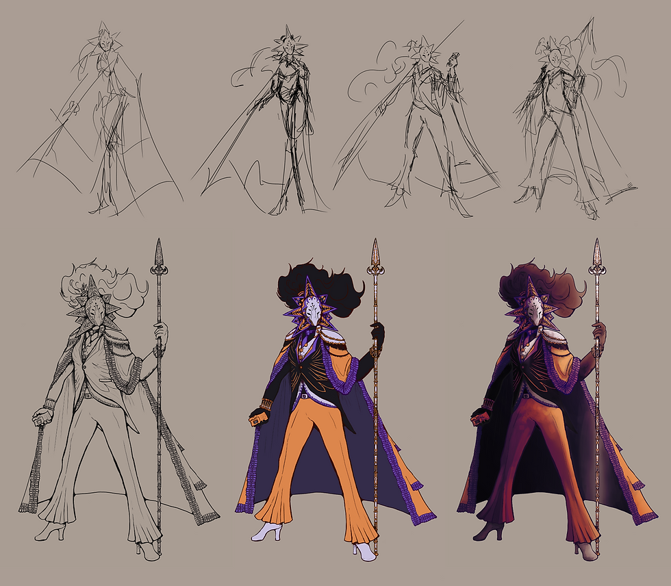
There were a few things that I knew I wanted to reference and/or keep in mind while updating their design. First, I wanted to make sure that their design hearkened back to Bufraeva (the original god) in some way. He had flowing black hair and seven eyes, so I figured the best way to reference that would be to put the Director's hair up in a ponytail and update their mask so its design would be a little cleaner.
The specific tweaks I made to their mask design are on the points of their mask (whose star symbolism is important) and their cheeks. For one, on the mask's points, there are now fingers that, when viewed from a distance, can almost resemble feathers. This is because Bufraeva has multiple arms, all of which used to be wings. Between those fingers are an eye (referencing Bufraeva's multiple eyes) followed by a few hearts (important plot element–Bufraeva didn't have a heart). The amount of eyes on the points of the mask correlates with the amount of gods present in my story. Lastly, there are raven wings on the mask's cheeks because the Director is frequently associated with both ravens and the raven constellation. The dots on their forehead are also roughly in the same place as where the stars of the raven constellation are, and the positioning of the wings is meant to make a beak-like shape.

Next, their torso. The raven wing motif continues here along with some repeated shapes and patterns that were featured in the mask. I wanted them to appear business-like, so I tried to incorporate a suit and tie into their outfit along with a cape with shoulderpads reminiscent of military leaders or high-ranking officials. The thing I was happiest with here was the hand-shaped clasps on their shirt! The left clasp (right for us) is the only one that's hand-shaped while the right (left for us) is on the circular side of things because once it's buttoned, you don't see it as much. Not visible in this zoomed-in image are their sleeve cuffs (which have a raven wing motif again) and the fact that their coat has a tail.

One of the final pieces of their design is the lace lining their cape. You can see the pattern for it below–I played around with the warp tool and copypasted as needed since the pattern is a little on the intricate side. Intricacy aside, though, the fingers and hearts from the mask come into play again here, this time to make a shape similar to a spinal cord from a distance. Depending on the positions of the Director's arms, the lace part of the cape may come down where their arms are or near their wrists, similarly to another character of mine, the Warden (who has actual spinal cords on their wrists like shackles). This parallel is important because the Warden is essentially multiple people who used to be Directors forced into one body and one mind for eternity.

That's about it in terms of their design! The last piece of their design that I can address is their high heels, which would theoretically make fighting hard. However, I think they're skilled enough at fighting where it doesn't matter as much (not to mention it's a fun look!). The high heels can also function as a reference to Bufraeva's bird feet, and I imagine they would make an ominous yet satisfying clicking sound on the floor when they approach you which could add to the encroaching dread you feel.


Comments